No Label Brewing Co. Rebranding and Cans
2017 - 2018 at Oak Interactive
Overview
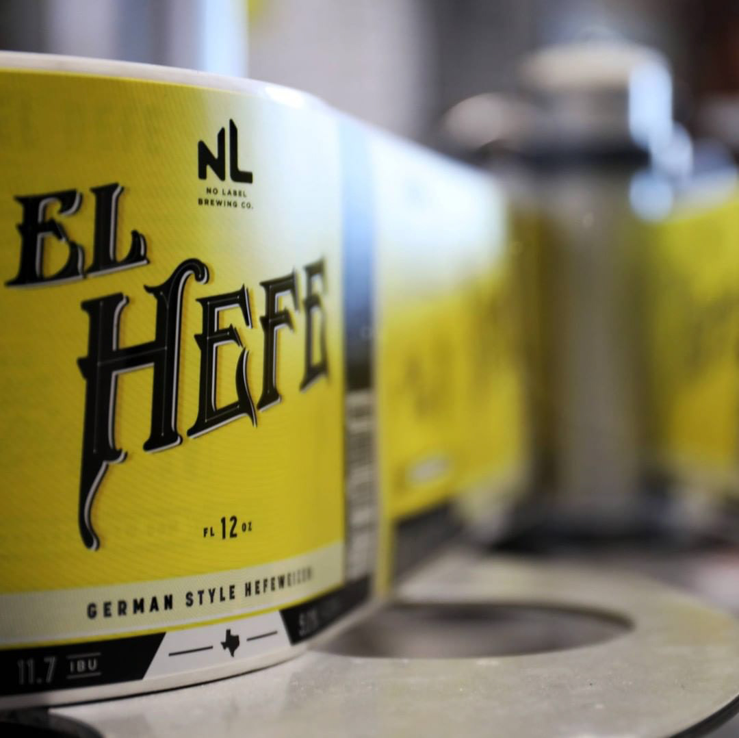
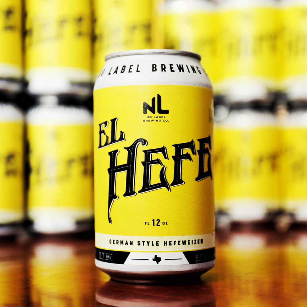
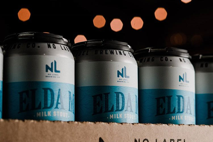
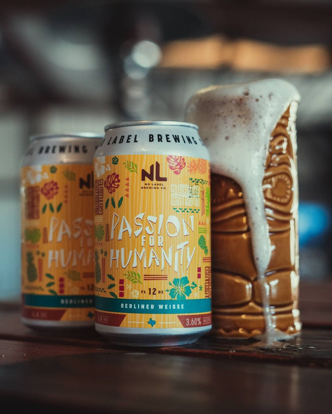
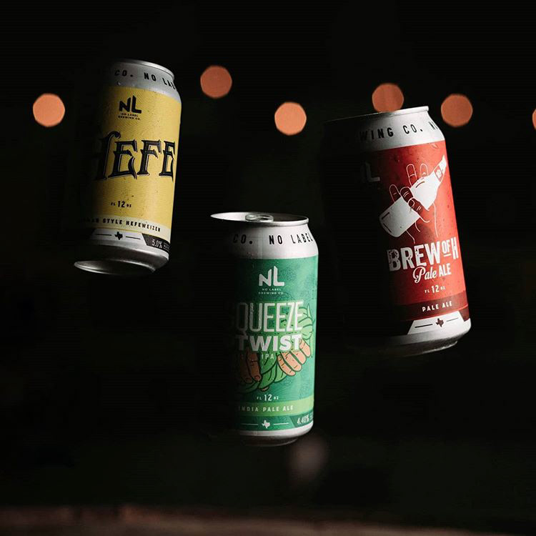
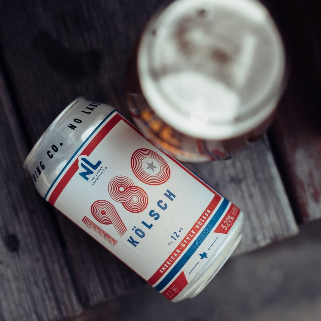
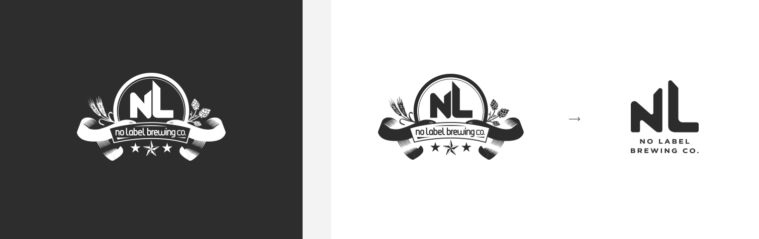
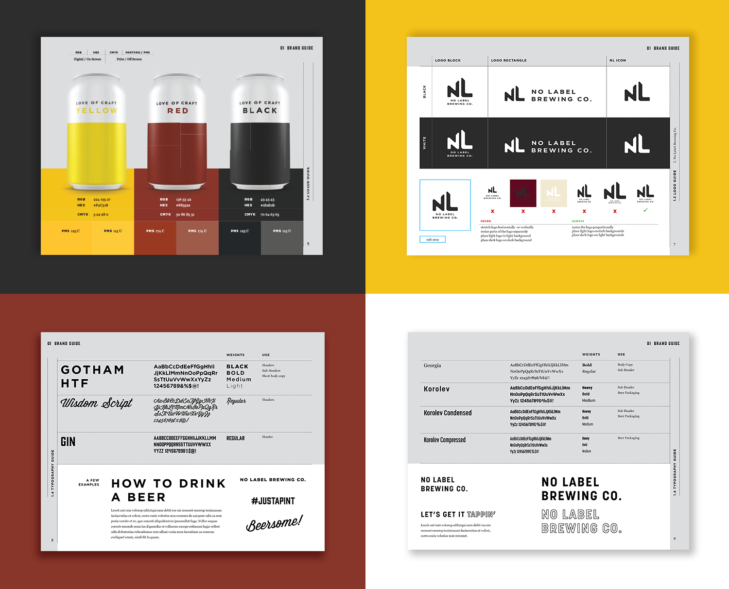
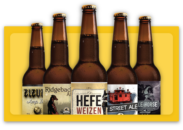
In 2017 No Label Brewing Co. revealed to Oak that they’d be transitioning from bottling their beer to canning. To compete with local and national craft breweries, and increase brand awareness and cohesiveness, NL wanted to create a simple, clean and cohesive design system for their new cans, which included a simplified logo to match the updated aesthetic.
Disciplines
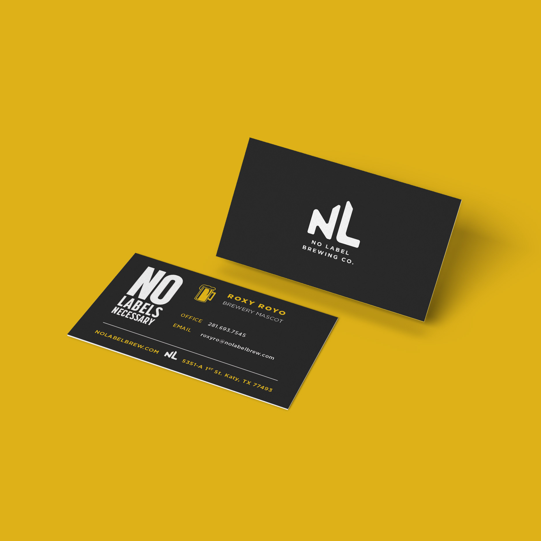
Identity Design
Layout Design
Packaging Design
Email Design
Digital Design
Motion Design
Social Media Design
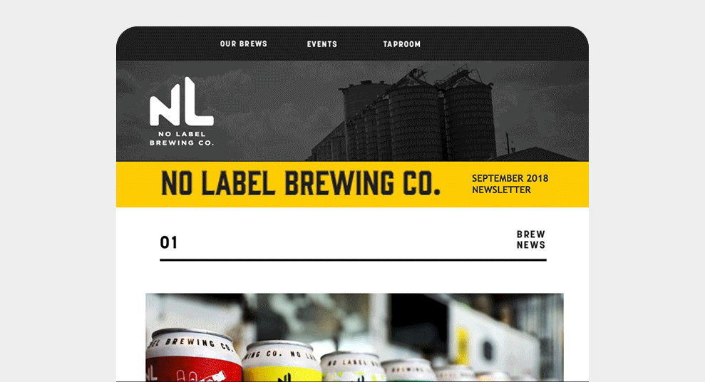
Email Template
Email Template gifs
Conflict
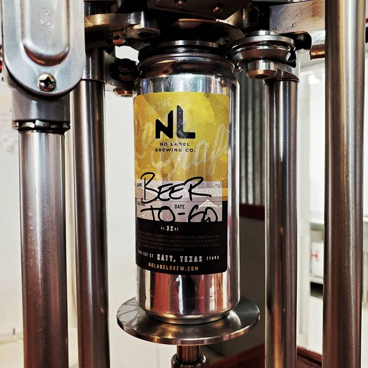
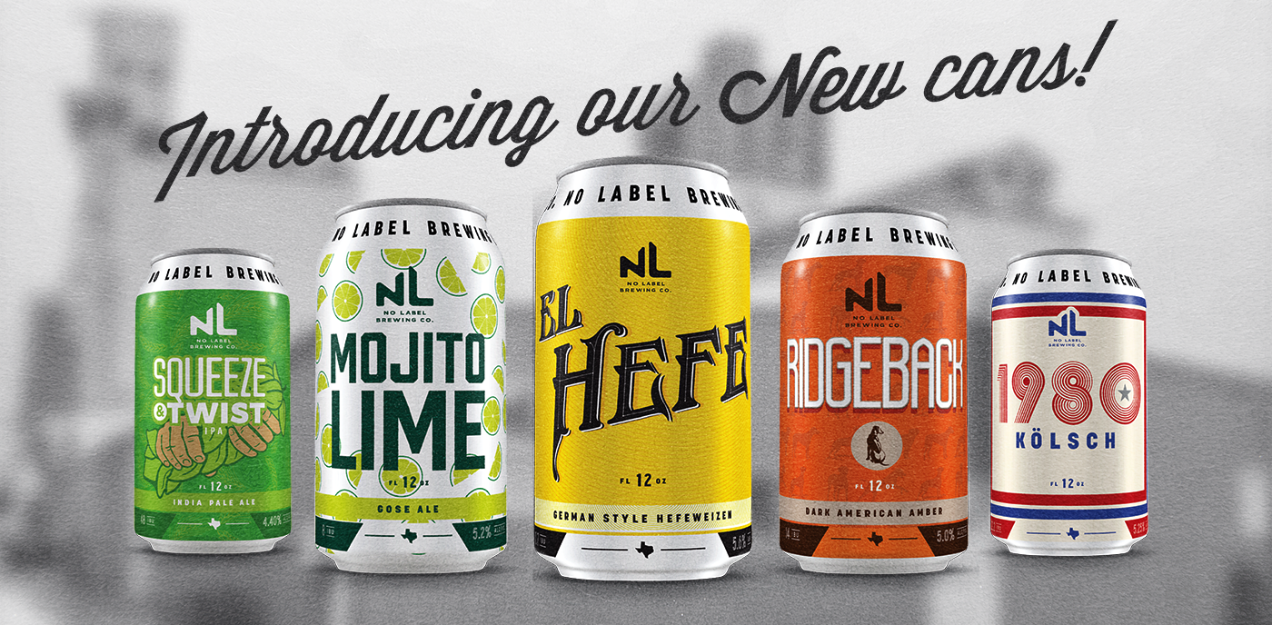
If No Label wanted custom cans for each beer, the minimum quantity required for production would leave them with more cans than beer to fill them. Instead of storing thousands of empty cans with the restriction of one beer type per can design, NL decided to print generic branded cans, and adhere custom labels for each beer style.
Can labels are adhered on an assembly line that only aligns labels horizontally but not vertically.
Curiosity
Which elements should be permanent on the can? How should those elements be positioned so the design reads correctly despite vertical alignment of label on can?
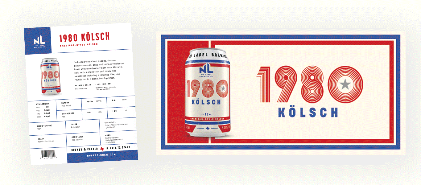
Beer Sell Sheets and Website sliders